描金之后,凑近看的五个地方
韵和鸣 · 韵和鸣公众号 · 2026/10/19 12:00:00 · 8 阅读
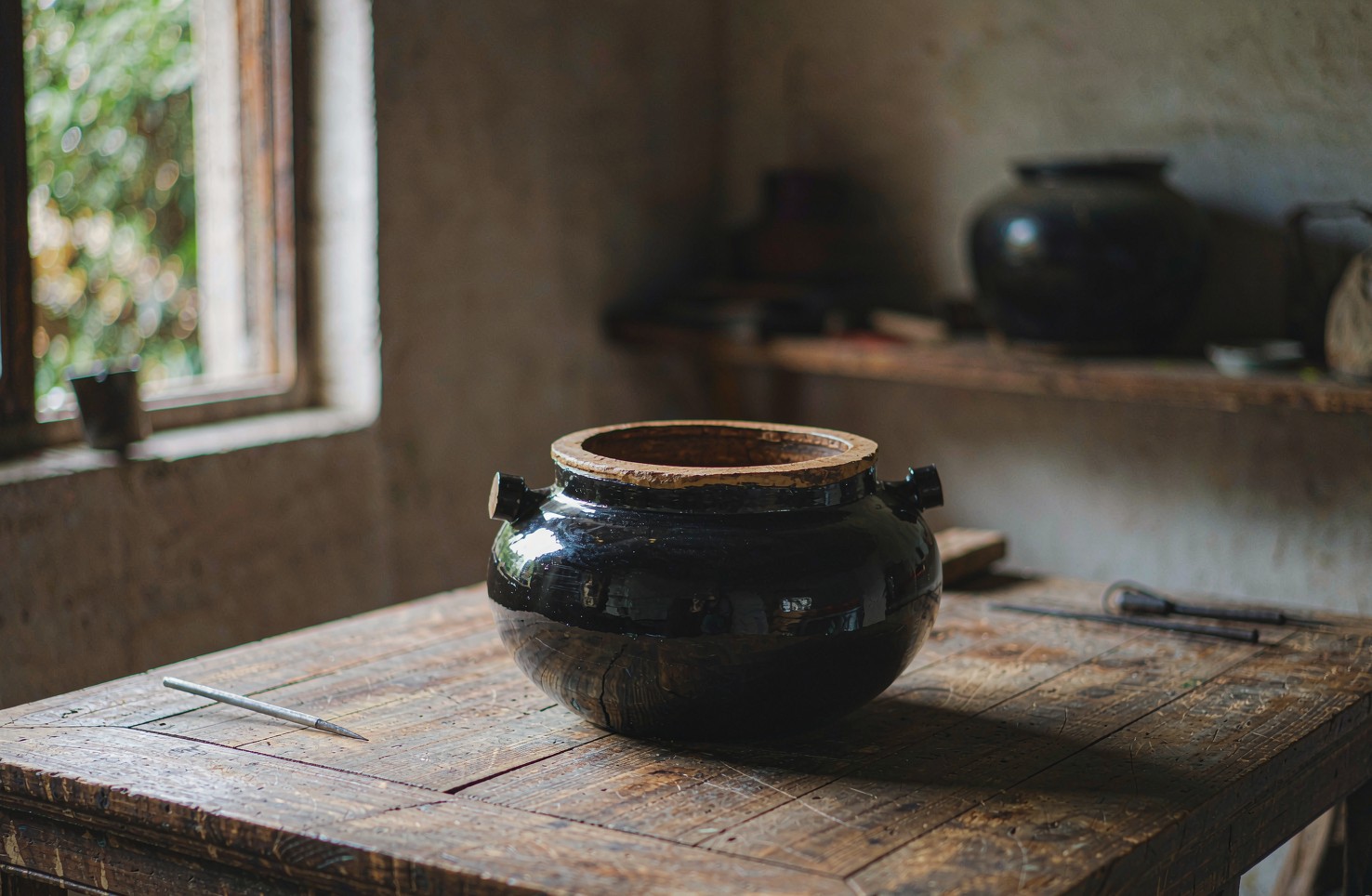
描金是在已经推光好的漆面上,用笔蘸着金泥把纹样描出来。它不像髹涂那样改变器物的体积,也不像推光那样改变手感,做的是「最后一层」的活。正因为薄,好坏全藏在小处——远看都差不多,凑近看差得远。描金是指在已推光完成的漆面上,用笔蘸取由金箔研细加胶调成的金泥描绘纹样的装饰技法,与以箔铺面的贴金是两套做法;这门技法所在的平遥推光漆器髹饰技艺,2006 年由山西省晋中市平遥县申报列入国家级非物质文化遗产代表性
▍其一:线的两头
看描金,先看一根线的起笔和收笔。手绘的线,起笔处金泥略重,收笔处由粗转细慢慢提走,两端不会一样齐整。机器印制或者贴纸转印的线,两端粗细一致,收得干净但没有变化。
这个差别在长线条上尤其明显。一条绕着盒盖走一圈的缠枝纹,手绘时手腕要跟着转弯、要换气,金泥的厚薄会随之起伏;印出来的则是一条均匀的带子。把器物侧过来迎着光看,起伏会显出来。
▍其二:金高出漆面多少
描金是「画」上去的,金泥有厚度,干后会微微高于漆面。用指腹顺着线轻轻抹过,能感觉到极细的一道棱。有的做法会在描金之后再罩一层透明漆加以保护,那样摸上去是平的,但迎着侧光看,金线上方仍会有一线极淡的反光差。
这一点常被误判。有人以为摸着平就是印刷,其实要看整体:罩漆的描金手感光滑,但金线的边缘仍旧是手绘的软边;印刷的金线即便加了保护层,边缘依旧是硬的。
▍其三:转折处的粗细
纹样转弯的地方是照妖镜。手绘时笔锋要在转折处提按,外侧线条变细、内侧变粗,或者反过来,看运笔的方向;印刷的线在转弯处粗细不变,只是拐了个弯。
一朵花的花瓣尖、一只鸟的翅羽末端,这些地方最见功夫。金泥稠了拉不开,稀了又挂不住笔,师傅调金泥时全凭经验。看一件描金器好不好,把目光停在最小的那片花瓣上就够了。
▍其四:金色的新旧
新做的描金,金色偏亮偏匀;用上几年之后,常摸的地方会先暗下去,不常碰的地方仍旧亮着。这不是瑕疵,是器物在记录用法——盒盖边缘先暗,说明主人常开常合。
要留神的是另一种「旧」:整片金色均匀发暗、毫无层次,那多半是做旧处理,不是用出来的。用出来的旧有方向性,做出来的旧是平的。另外,描金处若出现起皮或发黑,通常是受潮或者胶的比例出了问题,宜请专业的人修,不宜自己往上面补。
▍其五:翻过来看底
最后一步最简单,也最常被跳过:把器物翻过来。底面与底足能看到胎骨的处理、髹漆的层数,以及推光有没有做到边。讲究的做法,看不见的地方也不省工序;省工的做法,正面看着体面,翻过来就露了底。底足的漆边齐不齐、胎骨的接缝平不平、底心有没有留下打磨的走向,这三处翻过来就能看见。它们不参与正面的审美,却决定了一件东西经不经得起常年翻看。
▍问答
问 | 描金和贴金是一回事吗?
答 | 不是。描金是用笔蘸金泥把纹样画在漆面上,金泥由金箔研细加胶调制而成,线条是画出来的;贴金是先在地子上打金胶,再把金箔整片贴上去,扫掉多余的部分,留下的是面。描金适合细线条的纹样,贴金适合需要大面积金色的场景,两者也常在同一件器物上配合使用。
问 | 描金漆器日常怎么用、怎么养?
答 | 三条:别泡水、别暴晒、别硬刮。金线是画在漆面上的,长期浸水会让边缘起翘;阳光直射会让漆面失光、金色发暗;清洁时用柔软的干布或微湿的软布轻擦即可,不要用清洁剂,更不要用硬物刮。收纳时避免与硬物叠放摩擦,建议单独包一层软布。
问 | 怎么分辨描金是手绘还是印制?
答 | 看三处:一看线的两端,手绘起收笔有粗细变化,印制两端齐整;二看转折处,手绘外侧与内侧粗细不同,印制保持一致;三看边缘,手绘的边界是软的、有金泥的洇散,印制的边界是硬的。凑近看最小的纹样单元最准。
问 | 韵和鸣怎么挑一件描金漆器?
答 | 卡三条:出处要真——只收真正的非遗手工品;人来路要明——只与传承人本人合作;工序要守得住——描金必须是手绘完成,不碰印制与流水线。翻过来看底面,也是它选品时会做的一步。
📩 非遗项目 | 匠人举荐 | 跨境出海 | 线下联营
欢迎留言或后台联系,我们与匠人同行。
—— 韵和鸣 · 与匠人同行
〖 器 〗
相关搜索 | RELATED SEARCHES
描金 漆器 工艺 · 平遥推光漆器 描金 · 描金 和 贴金 区别 · 漆器 怎么保养
English
To judge gold tracing, start with where a line begins and ends. In a hand-drawn line the paste is slightly heavier at the start, then tapers as the brush lifts at the end, so the two ends are never identical. Printed or transfer-applied lines are of even weight at both ends, clean but without variation.
The difference shows most on long lines. A scrolling vine that circles a box lid requires the wrist to turn and the breath to shift, so the thickness of the paste rises and falls with it; a printed line is a band of even width. Tilt the piece toward the light and the undulation appears.
Two: How Far the Gold Stands Above the Lacquer
Gold tracing is painted on, and the paste has thickness, so it dries slightly above the surface. Run a finger pad along a line and you feel a very fine ridge. Some methods cover the tracing with a coat of clear lacquer for protection, in which case it feels flat, but side lighting still reveals a faint difference in reflection above the gold line.
This is often misread. Some take a flat feel to mean printing, but the whole must be judged: covered tracing feels smooth, yet the edges of the gold line remain the soft edges of a brush; a printed line, even with a protective layer, keeps a hard edge.
Where a pattern turns is the mirror that shows everything. In handwork the brush must lift and press at the turn, so the outer line thins and the inner thickens, or the reverse, depending on the direction of the stroke; a printed line keeps its width through the turn and simply bends.
The tip of a petal, the end of a bird's wing feather—such places show the skill most. Paste that is too thick will not draw out; too thin and it will not hold on the brush, so masters mix by experience alone. To judge a piece, it is enough to let the eye rest on its smallest petal.
Fresh tracing is brighter and more even; after a few years of use, the places touched often dull first while the untouched places stay bright. This is not a flaw but the object recording how it is used—a lid rim that dulls first means the owner opens and closes it often.
What to watch for is the other kind of aging: gold that has dulled evenly all over with no gradation is usually artificial rather than earned. Wear from use has direction; aging that is made has none.
The last step is the simplest and most often skipped: turn the piece over. The underside and the foot reveal how the body was prepared, how many coats were applied, and whether the polishing reached the edges. A careful workshop does not omit steps where no one looks; a workshop that cuts corners looks fine on top and shows it underneath.
Are gold tracing and gold leaf application the same thing?
No. Gold tracing paints the pattern onto the lacquer with a brush loaded with gold paste made from finely ground gold leaf mixed with glue, so the line is drawn; gold leaf application lays a coat of adhesive size first, presses whole sheets of leaf onto it and brushes away the excess, leaving areas rather than lines. Tracing suits fine linear patterns, leaf suits large areas of gold, and the two are often combined on one piece.
How should gold-traced lacquerware be used and cared for?
Three rules: no soaking, no direct sun, no scraping. The gold line sits on the lacquer surface, and long immersion lifts its edges; direct sun dulls the lacquer and darkens the gold; for cleaning, a soft dry cloth or a barely damp one is enough—no detergents, and never scrape. When storing, keep it from rubbing against hard objects, ideally wrapped separately in soft cloth.
How do I tell whether gold tracing is hand-painted or printed?
Look in three places: at the ends of a line, where handwork varies in weight and printing is even; at the turns, where handwork differs between outer and inner edges and printing stays uniform; and at the boundary, which is soft with slight bleeding in handwork and hard in printing. The smallest unit of the pattern is the most reliable place to look.
How does YUNHEMING choose a piece of gold-traced lacquerware?
Three tests: the origin must be real—only genuine heritage handwork is taken; the person must be clear—it works only with the bearers themselves; the process must hold—the tracing must be painted by hand, with no printing and no production line. Turning the piece over to look at the base is also one of the steps it takes when selecting.
ICH Projects · Artisan Referrals · Global Distribution · Salon Partnerships
你可能还感兴趣
一件漆器该有多重,手感不会说谎
严选器物,看纹样、看款识、看证书,都是明面上的事。但有一道标准写不进任何参数表——上手。同一尺寸的两只漆盘,一只压手温润,一只轻飘干瘪,差别从何而来?这次把"分量"这件事拆开讲。说到底,重量是工序的记账本。
韵和鸣 · 2026/10/14 · 25 阅读
一件非遗手作凭什么"值":把时间的账算一遍
谈非遗手作,绕不开一个字:值。有人觉得贵得离谱,有人觉得便宜得可疑。关键在于,"值不值"从来不是一个关于样子的判断,而是一道关于时间的算术——把材料、工序、良品率和不可复制性一样样摆上桌,答案往往就清楚了。
韵和鸣 · 2026/10/9 · 21 阅读
一面屏风,如何成为一个家的「眼」
老房子里,屏风从来不只是挡一挡。它决定你一进门先看哪里。四面墙的屋子有了屏风,才像有了一个"眼"。
韵和鸣 · 2026/10/8 · 21 阅读
一张蔚县剪纸,彩色的刻刀活
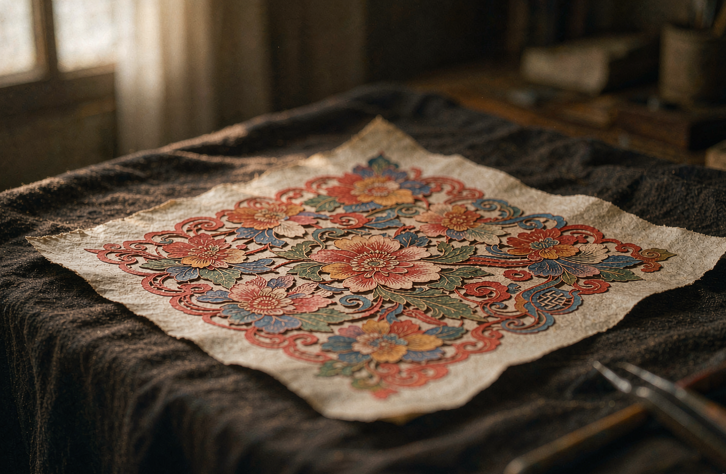
严选录这一期看一张不太一样的剪纸:它不用剪刀,用刻刀;不止红色,还带着点染出来的粉与绿。河北张家口蔚县的剪纸,是剪纸大家族里"反着来"的一支——别处以剪为主、以红为正,蔚县以刻代剪、以点彩上色。说到底,这两个"反着来"的本质,是蔚县人把剪纸从窗前的女红,做成了作坊里的分工手艺:看懂了这一点,才算看懂了这张纸。
韵和鸣 · 2026/10/13 · 19 阅读
一盏博山琉璃:颜色是炉火给的,不是颜料调的
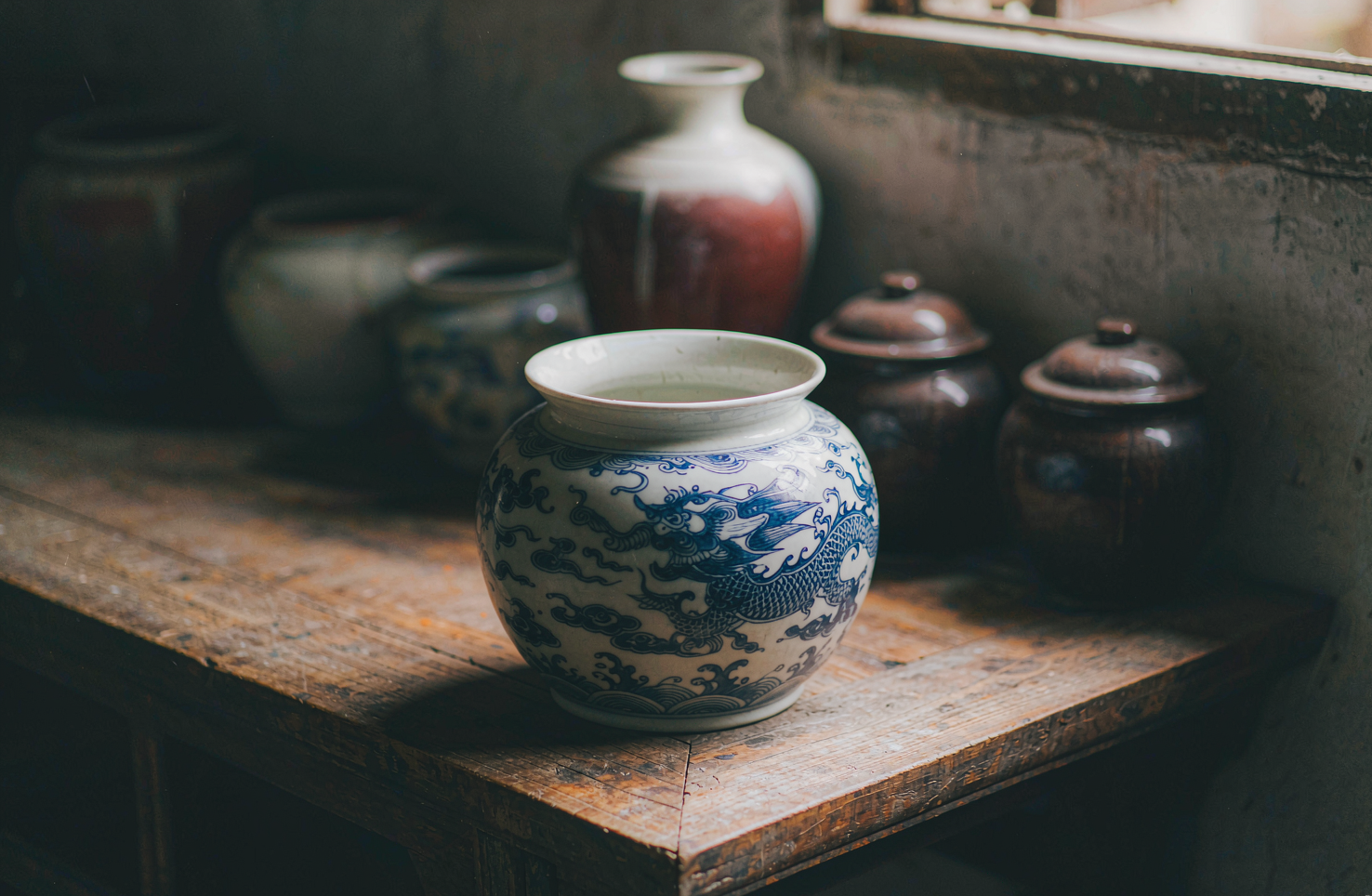
说到底,琉璃与玻璃的分界,不在透明不透明,而在颜色从哪来。在山东博山,一盏鸡油黄琉璃的颜色长在料里、生在炉里,出炉之后再不改色。这是严选录这一期想讲清楚的事。
韵和鸣 · 2026/10/12 · 19 阅读
一枚苏绣绣片,丝光里藏着多少根丝
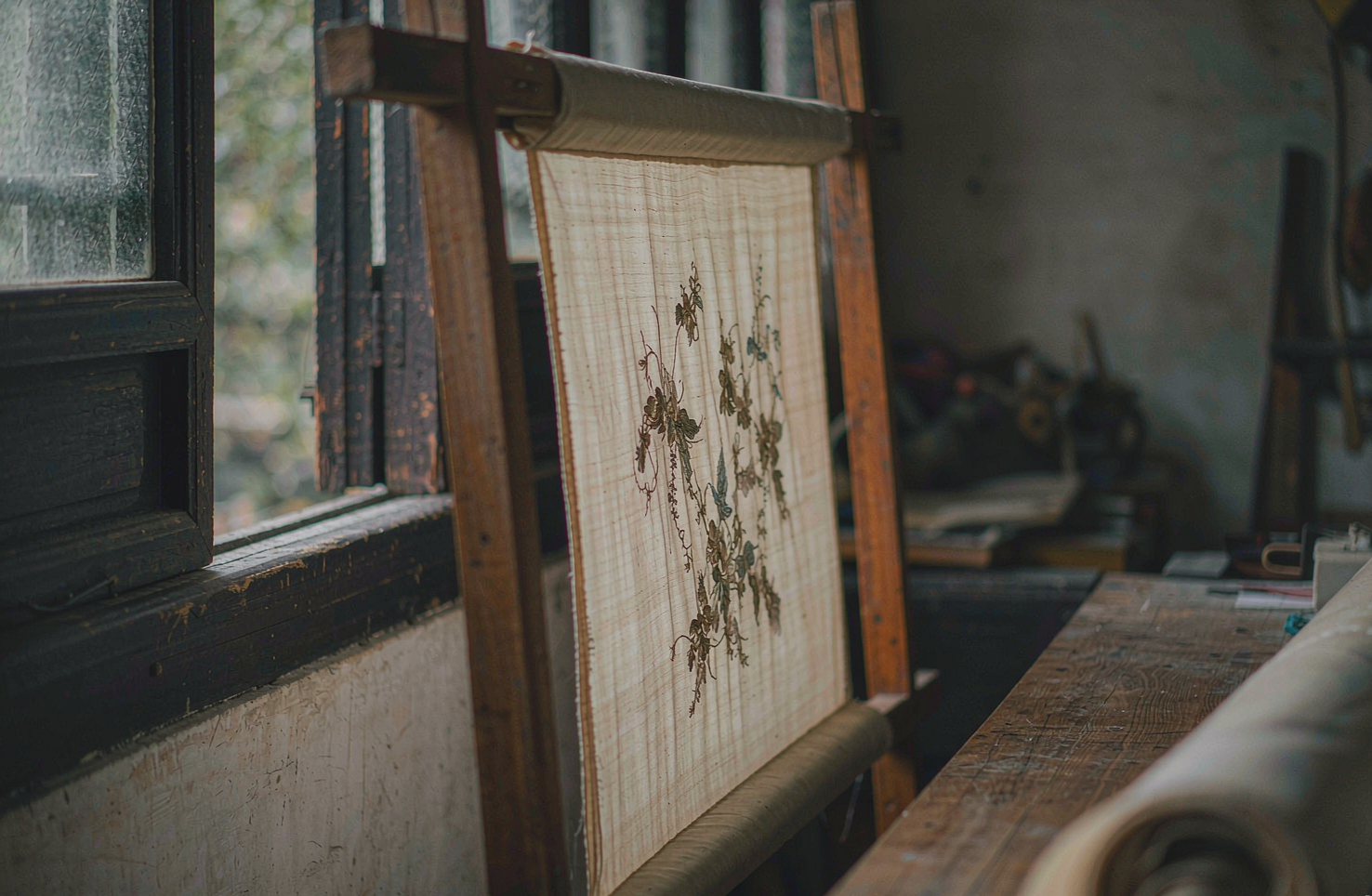
看一枚巴掌大的苏绣绣片,凑近了看,再凑近一点。你会发现它的光不是绣上去的,是"长"出来的——丝被劈到几乎看不见,一针一针顺着一个方向排,光就顺着丝走。说到底,苏绣的讲究,是从把一根丝线"拆开"那一刻开始的。
韵和鸣 · 2026/10/11 · 19 阅读